
2020 has been a chaotic year, but it’s also been a booming time for ecommerce. US retailers’ online year-over-year growth shot up to 68% in mid-April, surpassing its earlier peak of 49% in mid-January.
And while growth for retail has cooled, the ecommerce market share is still taking a progressively larger slice of the pie. Sales are expected to see a 265% growth rate by 2021, a total value of $4.9 trillion.
That’s both good and bad news for ecommerce vendors and advertisers.
The good news: you’re in a wildly lucrative industry. The bad news: you’re in a wildly lucrative industry with lots of competition.
It’s no longer enough simply to make sales. You need a strong conversion rate in order to strengthen your revenue, because anything else is a clear message: your customers are taking their business elsewhere.
Here, we’re doing a deep-dive into what makes your ecommerce conversion rates tick and what you can do to improve them.
Key Areas to Improve Ecommerce Conversion Rates
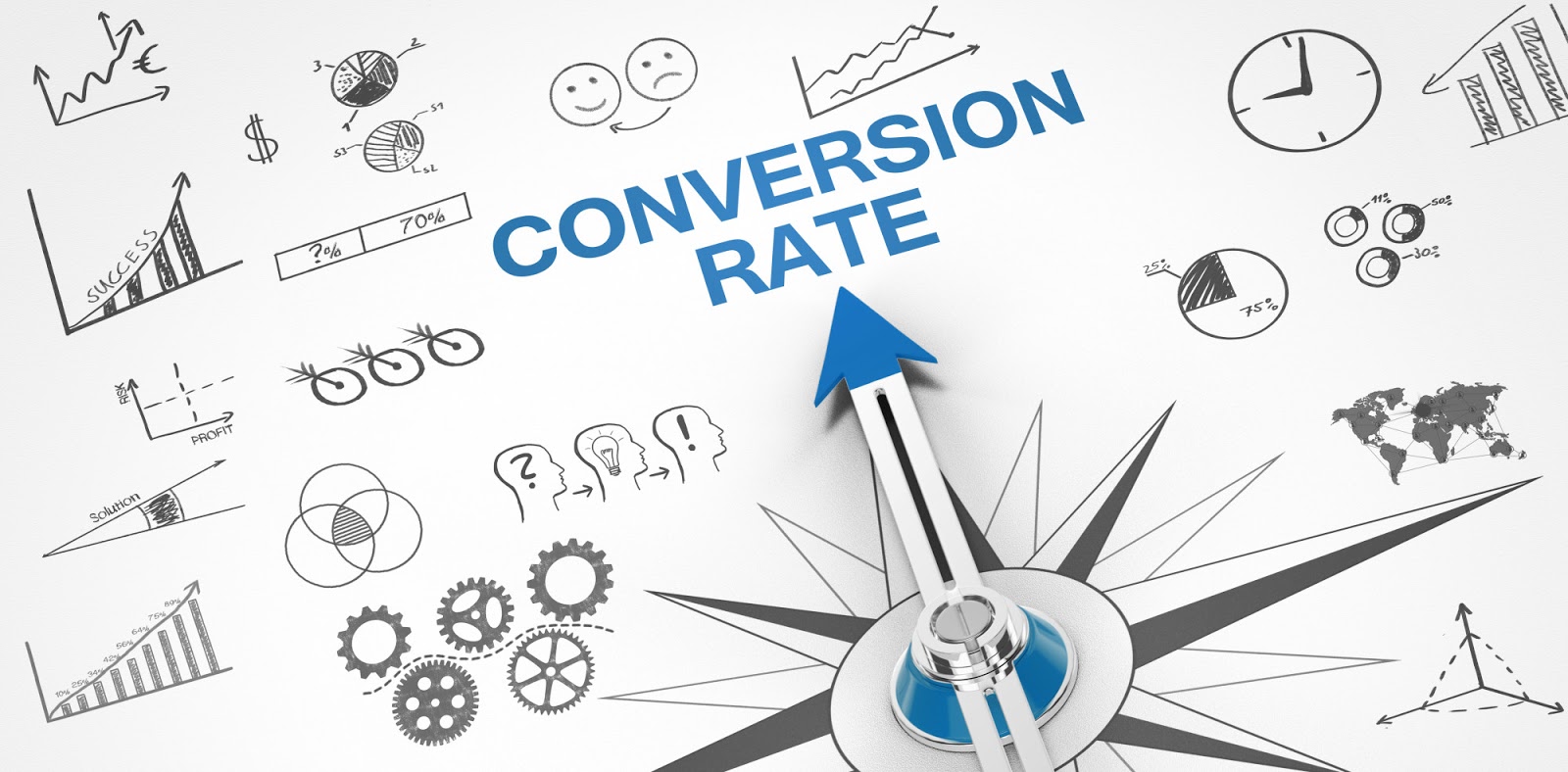
The first step is knowing where you’re coming from. And that means understanding your conversion rate.
What is a “Good” Conversion Rate?
Google defines conversion rate as “The ratio of transactions to sessions, expressed as a percentage. For example, a ratio of one transaction to every ten sessions would be expressed as an Ecommerce Conversion Rate of 10%.”
It can also be understood in simpler terms as the number of visitors who land on your site page and complete a desired action. The most common example is the percentage of website visitors who stopped by your store and bought something.
Sounds simple enough, right?
However, keep in mind that the definition is “desired action” rather than transaction After all, if you want your visitors to do something and they then do it, that technically counts as a conversion. A few common examples of ecommerce conversions include:
- Online sale
- Adding a product to a cart
- Email signups
- Adding an item to a wishlist
- Social media shares
In reality, your “conversion rate” can be measured using any API your company finds valuable. There are also so many variables between one website and the next that it’s difficult to do an apples-to-apples comparison between sites.
For the sake of simplicity, though, we’ll narrow the playing field a bit.
How is Conversion Rate Measured?
Most analytics tools will segment data for you, which makes them useful for measuring your conversion rate based on a variety of APIs.
The key, though, is to know what API you’re interested in and what your customers are doing on your site in order to set up proper conversion rate benchmarks. In other words, where are your customers getting stuck when they interact with your site?
In order to keep things simple, we’ll go with a familiar metric of conversion: an online sale.
Let’s say, for example, that your online store gets 5,000 visitors in a month, with 50 visitors buying something (converting) in that month. That gives you a conversion rate of 1% (50 / 5000 = 0.01). Just divide the number of conversions by the number of visitors and voila: conversion rate.
So…What is a Good Conversion Rate, Anyway?
The Adobe Digital Index 2020 shows a wide variation in conversion rates across sectors.
As such, what qualifies as a “good” conversion rate depends heavily on your sector. Electronics, for example, has an average conversion rate of 2.7%, while arts and crafts has an average of 4.01%, which is about four times the conversion rate for food and drink (0.90%).
You should also be careful when comparing yourself to the competition–Amazon, for example, boasts a 13% conversion rate, which is seven times the industry average. Think about your next closest competitor, rather than the biggest fish in the industry, and use that as a benchmark.
Also, keep in mind that a “good” conversion rate depends heavily on context. If your average order size is $15 and your conversion rate is 2%, that’s a terrible conversion rate. If your average order size is $995 and your conversion rate is 2%, that’s a fantastic conversion rate.
The key is to understand what you’re trying to achieve in the context of your business, how you’re trying to measure it, and what your concept of success looks like. That way, you can turn a critical eye to your conversion rate to see if your sales efforts are panning out.
Typical Areas for Conversion
We went through all of this because your conversion rate is tied to your customer behavior. If you don’t know what you’re trying to measure, you won’t know how your customer behavior influences your ultimate conversion rate.
Keep in mind that customers behave differently at various points in your ecommerce site. Behavior in one area may be good, but if you’re not measuring your conversion rate in a way that’s relevant to that area, it won’t help you.
In plain English: you have to know what you want to measure and how your customers behave so that you know where their behavior is going awry, thus dragging down your conversion rate. This will make it easier to optimize various parts of your site for conversion.
Common conversion sites (or rather, areas where conversion behavior goes wrong) include:
- Product pages
- Website navigation
- Shopping cart and checkout
- Shipping
Let’s take a closer look at each area and what you can do to improve your performance.
Product Pages
Product pages are where you can draw your customers in, where you can convince them to put an item in their cart or in their wishlist. These are the pages where you can first convince the customer that a product is worth buying.
And yet, far too many product pages fall short. Here’s how to make yours better.
Pre-Cart Landing Pages
Despite the fact that 1 in 4 online shoppers start their customer journey with a product page, 96% of those customers aren’t ready to buy when they land on that product page. And as a result, they don’t buy.
The reason for this disconnect is simple: product pages are failing to engage customers. Customers are not already warm when they land on a product page, which means the page’s sales efforts are not enough to motivate them to convert.
This is where pre-cart landing pages can help.
A pre-cart landing page is an ecommerce post-click page that bridges the gap between an ecommerce ad and the product page. It picks up the slack between interest in the ad and willingness to convert on the product page.
It does this by picking up where the ad leaves off, providing the customer with more information about the offer described in the ad. It matches the ad message consistently as a natural extension of the ad.
It does not overwhelm the visitor with choices, but rather focuses on the specific offer contained in the ad. It offers just enough more information to continue enticing the user based on what they saw in the ad. That way, they won’t be overwhelmed by choices when they continue to the product page, since they can focus on the product you advertised.
This is a fantastic way to streamline the user experience, engaging customers so that they arrive at your product pages ready to convert. Pre-cart landing pages move the customer further along in their buyer’s journey so that when they reach the product page, they’re much more likely to take action.
Quality Photography
Once the customer arrives on the page, though, you have to continue to entice them. This is the ecommerce equivalent of the moment a customer walks into a store.
The difference between a brick-and-mortar retail store and an ecommerce store is that you can’t woo your customers with a physical product. So, you have to make up the sensory experience to entice them.
The best way to do this is with high-quality product photography.
It’s not enough to simply photograph a piece. Your customers are making the decision to buy a product they have never seen or handled in person. The only way for them to accurately make their value judgement is by having a clear idea of the product they’re getting. Product photography is what bridges the gap.
Remember–people want to see what they’re getting. So show them what they’re getting, and do it the same way a person would inspect a product–from multiple angles.
Your photography should offer multiple views of the product, giving the customer different angles and contexts. High-definition, up-close images can also help demonstrate the texture of the product.
Think about the various questions your customers would ask about a product and take photos accordingly. These include things like:
- What does the fabric look like up close?
- What do these shoes look like from the back/sides/front/top?
- What does this color look like in different lighting?
- What is the sizing of this product relative to a person?
Your product photos should eliminate many of these questions for the customer, making it much easier for them to commit to a buying decision.
Engaging Copy
While a picture is worth a thousand words, the power of product copy is strong. Don’t believe it? Here’s an example.
Let’s say you have two candles. They both have holiday smells–vanilla, cinnamon, clove. One costs $19.99, the other costs $30.
The $19.99 candle’s product description reads, “Relax with the warm scent of pure vanilla, cinnamon, and clove.”
The $30 candle’s product description reads, “When the kids are snug in their beds dreaming of a visit from Saint Nick, enjoy the comforting scent of this candle (inspired by the poem “A Visit from St. Nicholas”). This soy wax blend features the warm, soothing essential oils of cinnamon, vanilla, and woodsy clove for a sugar-plum-worthy scent, the perfect companion for a long winter’s nap.”
Which candle would you buy? Probably the $30 one, even if you’ve neither seen nor smelled the thing.
What makes the difference? After all, both descriptions are still describing the same basic candle. The first product description is okay, covering the bare bones basics of what the candle smells like, but the second description invites the customer in for a story, one where customers can envision a slightly better version of a long winter nap complete with the candle.
Remember, the role of product copy is to give the customer just enough information so that they can convince themselves to buy, rather than being wheedled.
You should have a short description and a long description. The short description should cover all the basics:
- Who the product is for
- What the product does
- Why the product is the best
The long description should enumerate further on the same basic information, answering any and every user question.
Put it this way: if someone reads all of the copy and still has a question, you’ve got a problem. If someone reads half the copy and decides to buy without finishing the rest, you’ve got a conversion.
Website Navigation
While it is a good idea to control your user’s journey from the wilds of the Internet to your product page, the truth is that users are still going to meander around your site. Whether that meandering is a pleasant stroll or not changes whether or not they convert.
Your navigation should be clear, intuitive, and easy. The best way to test this is by having someone who didn’t design your site take it for a test run. Remember, your designers built the site from the ground up–it doesn’t make sense to have them test the maze when they already know how to navigate the maze, figuratively speaking.
There are a couple ways to help bolster the user experience. Here are a few key ones for ecommerce.
Optimize for Shopability
It might sound obvious, but your site should be organized for shopability, i.e. the way that users shop.
Start by asking yourself: is your site organized in a way that encourages users to find what they want, browse your offerings, and purchase multiple items in a single transaction? If not, you’re diminishing your chances of such transactions occurring.
The best way to do this is by making it easy for users to find exactly what they need in one click, without the need to dig around (hint: customers rarely, if ever, have the patience for hide-and-seek games unless they happen to be longtime customers loyal to one specific product). This goes hand-in-hand with strong product categorization.
Remove Distractions
It also means removing as many distractions as possible from your website. Remember, you want your customers to perform a desired action, and anything that distracts them from that action makes them less likely to complete it.
The tricky part is that what you see as necessary marketing might be viewed as unnecessary distractions by your customers. There are also some marketing data collection fields that you might see as necessary which drive your customers away.
Form fields are a major culprit here. Don’t believe it? Picture this.
You find a product you really like. You want to buy it. But to do that, the site prompts you to fill out a form. Fair enough, you think, and click to get started.
Then you see a laundry list of form fields asking everything except what you ate for breakfast this morning. This is a form that requires multiple steps, like pulling out your credit card and backup information you don’t typically keep on hand.
So, like any impatient buyer, you decide the form isn’t worth your time right now and close the page. And then you forget to buy.
Sound familiar? We just described the all-too-common process of how form fields cost you customers. And chances are, it happens to you all the time.
If you’re not sure what counts as a distraction and what doesn’t, A/B testing is your new best friend. Be thorough and rigorous in your testing process so that when your website is ready to make its world debut, it struts onstage free of distractions that drive customers into the arms of your competitors.
Shopping Cart and Checkout
Ah, the shopping cart and checkout section. In the grocery store, it’s the moment where you commit to standing in line to pay for the food in your cart.
In ecommerce, though, it’s the moment you can lose many customers without even realizing it.
In fact, this is the moment when far too many customers back out of a purchase. Over three-quarters of customers, in fact, abandon their shopping carts instead of making a purchase.
This is partially due to rising user sophistication. Customers know that they can find comparable products elsewhere on the Internet, and because of the ease of shifting between sites, they’re willing to comparison shop even when they already have items in their cart.
In fact, they’re more likely to comparison shop as they move toward checkout, to make sure that these items are actually the ones they want to purchase.
As an ecommerce store, then, your goal is to reduce shopping cart abandonment so that users follow through on their conversions. Here are a few ways to make that happen.
Shopping Cart Persistence
Generally, people abandon their online carts for one of five reasons:
- High price
- Shipping costs
- Hassle
- Doubt
- Site speed
While you can’t control what your competitors do, you can control many of these factors on your own site. Take hassle, for example.
You know that customers tend to comparison shop throughout their purchasing journey, especially as they get closer to checkout. If they switch to another site only to find that their cart items have been cleared out, they’re going to be frustrated–probably even frustrated enough to purchase elsewhere, simply because of the hassle of finding items again.
You can combat this with shopping cart persistence. This can be achieved with a persistent cookie, allowing users to keep the contents of their cart for several days or even a week.
You can also give users the option of saving their cart content, usually by creating an account. This is a clever method because it invites the user to offer up their email address, at which point you can send them a reminder email about the items in their cart (retrievable through a link, of course). This helps keep you front-of-mind.
Promote Cart Contents
Another technique is to remind users of their cart contents–while they’re still on your site shopping around.
Remember: your job as a marketer is not over once a customer clicks that coveted “Add to Cart” button. In fact, your job is only halfway done, since customers are more likely to comparison shop the closer they get to a final purchase.
Take a cue from Amazon, which reminds customers about the contents of their cart, including a subtotal, items in the cart, and photos of each item. This actually makes it easier for customers to remember what they have in their cart while comparison shopping on your own site, a convenience customers will thank you for.
Looking to Boost Your Conversions?
Ready to change the way you sell to your customers?
Hey, we get it. Boosting your ecommerce conversion rates is no Sunday stroll. But it gets a lot easier if you have the right toolkit. That’s where we can help, with expert marketing advice to drive results.
Let’s change the way you think about conversions. Get in touch today to let us know how we can help.